Since the introduction of the General Data Protection Regulation (GDPR) in May 2018, the rules have changed. Does your company manage your users' personal data? Then you need to install a cookie banner on your website to ask them for permission to use your trackers on them. Yes, but it's not all about a simple information banner.
More than that, you need to ensure security and confidentiality for your users while offering them an exceptional experience. You must also optimize the consent rate, i.e. the share of Internet users authorizing you to place cookies on their devices (because without consent, no data collection!). A major challenge to take up!
How do you make the collection of consent to cookies worthwhile in the eyes of your users? Didomi presents 15 brands that customize their cookie consent banners.
Summary
- Cookie Banners: To conform to the GDPR and digital marketing
- Why work on cookie banner design?
- Where to place the cookie banner?
- Design the cookie banner buttons
- 15 examples of cookie collection banners
- Conclusion
|
Yes We Trust Summit: Didomi organized a worldwide event on October 7th 2021 on how privacy drives business Is the internet equal? Do we all have the same privileges and rights? Should there be top-down data regulation from governments or bottom-up from the people? Should governments be able to understand these data complexities? Watch the replay to know more.
|

.png?width=1200&name=YWT_Speakers%20(rectangle).png)
Cookie Banners: To conform to the GDPR and digital marketing
Of course, from your point of view, cookies are essential to offer the best quality of service to your users (page personalization, shopping cart registration, adaptation to user geolocation, etc.). The user sees them rather as tracers that will store his personal information, often without his consent. With this in mind, the EU, therefore, implemented the famous DPMR in 2018, obliging all websites that use cookies to ask for prior authorization from their users before retrieving and storing their data.

Thus, whether in the form of a banner, a full window or a notification in the corner of the screen, it is essential to ask your users for their consent to cookies. They will then be able to accept, refuse or redefine their preferences regarding your use of cookies. You already know this, but since a reminder sting never hurts, the notification should appear to the user on their first visit and include three main components. Indeed, you must:
-
Indicate your cookie policy: this will describe all the cookies you use, the category to which they belong (social media or advertising for example), as well as how the user can manage their settings. There is even a standard for this, called the Transparency and Consent Framework (TCF) ;
-
Allow the user to indicate his preferences: he will then be able to consent or not to certain categories of cookies. However, you do not need to direct it by checking certain categories by default. The user must expressly give his consent;
-
Allow the user to consent to cookies: the collection of his or her consent must be unambiguous. In other words, implied consent or pre-ticked boxes are no longer allowed. It is essential that the user be able to give consent by clicking on a button for example.
Please be aware that the CNIL will soon issue formal recommendations on how to collect consent from cookies. And cookies are part of their 3 control priorities in 2020!
Why work on cookie banner design?
As part of your digital marketing actions, you have worked and reworked your website to offer the best possible user experience, and that's fine. So why not go all the way and work on your cookie banner as well?
Very often, the user takes the cookie banner for yet another advertisement that pollutes his screen, even though he is now much more informed on the subject. Why does he react like that? Well simply because the cookie banner is always placed in the same place, in the same format. To escape from it, he will then click on the cross, change the page, or worse, leave your site.
It's a shame because if your cookie banner is well thought out, there is no reason why the user should not give you his consent.
So how do you make it attractive?
The first thing to do is to stand out from the many sites that install a very simple banner with the same boat phrase. Since you have to collect the consent of your users, you might as well take full responsibility and make it more fun. Stand out so that your users are interested in your cookie banner and read it. Show them that at home, they have a choice!

|
Want to see some examples of Didomi clients who are nailing their cookie banner implementation and personnalisation? Check out our article on the subject here.
|
%20(1).png?width=1740&name=INFO%20__%20RECTANGLE%20-%20BLOG%20IMAGES%20-%20ASSETS%20%20(7)%20(1).png)
Where to place the cookie banner?
Once you have agreed on the text to be included in your cookie banner, all you have to do is decide how you will display it.
A word of advice: don't be like everyone else and dare to personalise!
Banner? Full screen page? Pop-up? Notification hardly noticeable or on the contrary impossible to ignore? Does the collection of your users' consent have to be done in the header? At the bottom of the window? In the center of the page? Should it be floating or persistent?
These are all questions you need to ask to improve your digital marketing. After all, it's not just a question of reflecting your brand personality, but also and above all of optimising the opt-in rate, which gives you access to your users' data.
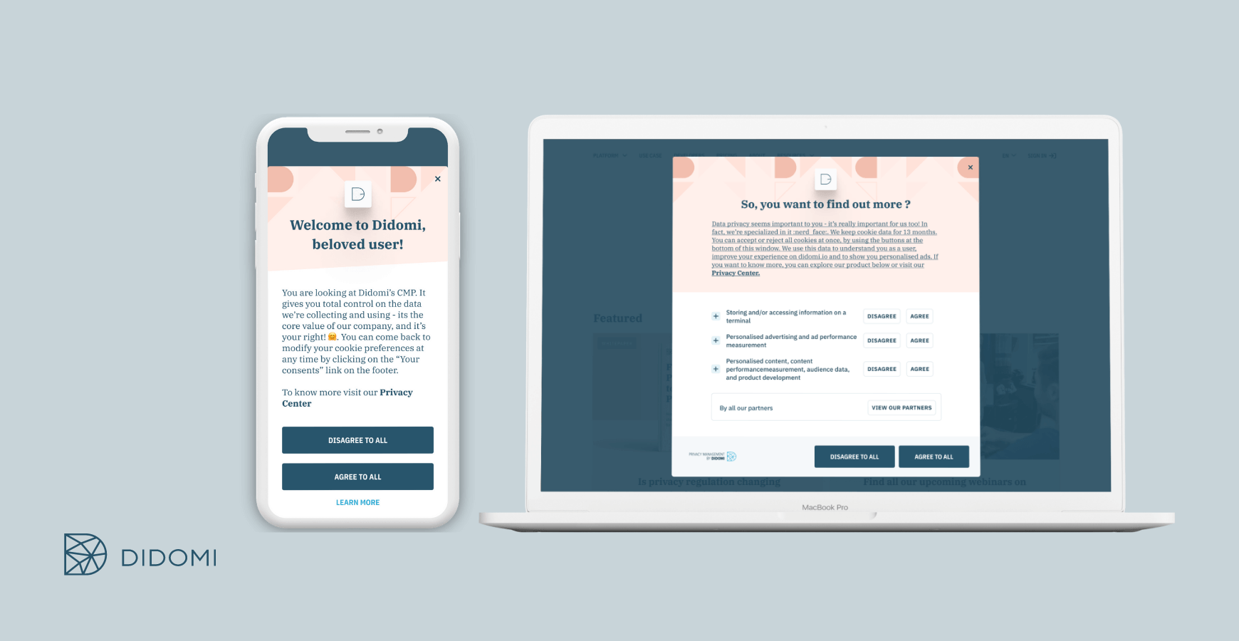
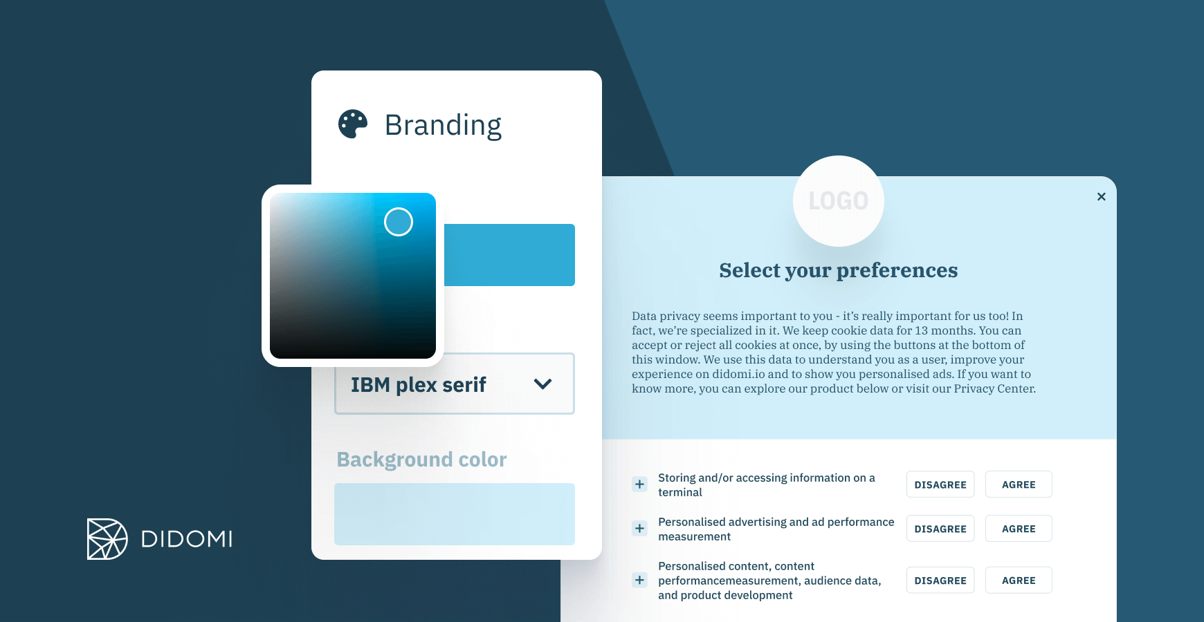
Didomi's Consent Management Platform (CMP) solution allows brands to fine-tune their consent banners and continuously optimise their performance.

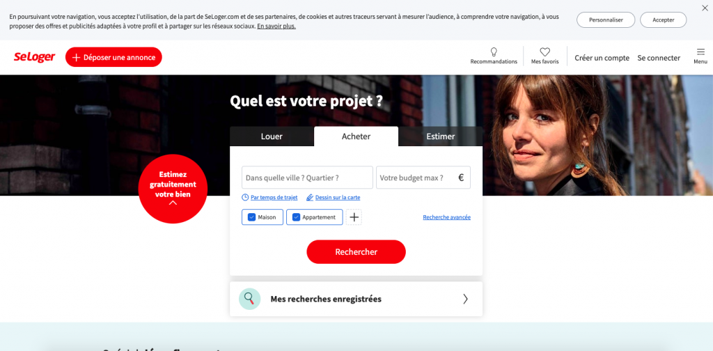
Cookie banners in the header
If you place the cookie banner in the heading, you can be sure that it will be immediately visible to all your visitors. Nevertheless, this location is also the one favoured by many sites that want to inform Internet users of the implementation of a coupon code for example. This is for example the choice made by SeLoger by allowing its visitors to give their consent to cookies as soon as they arrive on its site:
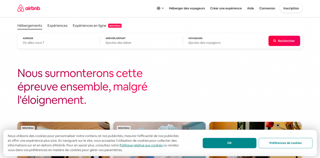
Cookie banners at the end of the page
Less discreet than the header banner, the footer banner is unmistakable! The footer can therefore be an ideal place to collect the consent of its users. Airbnb has set up a cookie banner which is a good indicator. Impossible to miss!
The « pop-up »cookie banner
Much more intrusive than the two previous examples, this type of banner cookie blocks access to the site, sometimes even forcing the user to accept or manage the trackers before accessing the site. A "pop-up" should not force the user to accept, it should also make it possible to refuse... with all due respect to the brands' marketing departments!
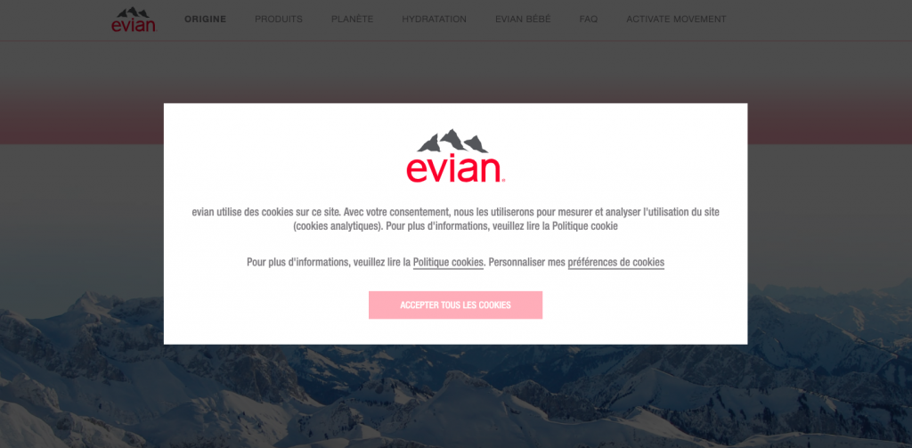
Rather than completely blocking navigation, Evian has preferred to darken the background to allow the user to view the content of its site all the same. Nonetheless, the user is very strongly encouraged - if not forced - to accept cookies, and cannot ignore your collection of consent. There is no ambiguity or uncertainty as to the user's will in this case. Not sure that the CNIL appreciates it, though!
Here, the site has chosen to completely block access to its content. So, good or bad idea? It's up to you to decide, but this option seemed to us to be embarrassing for the user and likely to make him leave the page. Nevertheless, you should know that the French (CNIL) and European (EDPB) regulators will soon no longer allow these cookie-walls (banners blocking access to the site on condition that they accept the deposit of cookies).
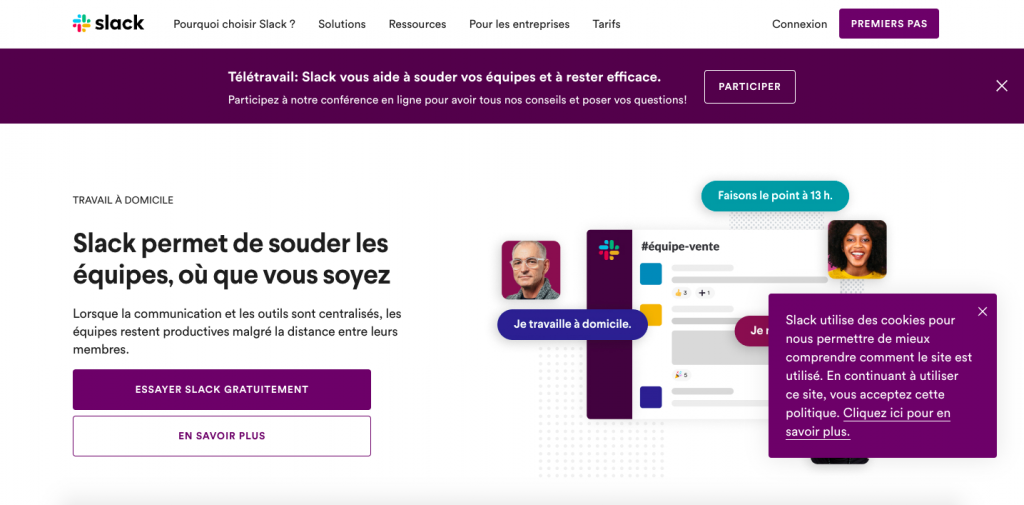
The cookie banner « notification »
Very non-intrusive, this type of banner can be placed in the left or right corner of the site. It is more aesthetically appealing, but must be visible enough to encourage the user to interact with you. This is the option favoured by some of the companies listed below, as well as Slack:
Design the cookie banner buttons
In addition to the positioning of your cookie banner, you will need to think about the appearance of your consent collection, in particular the design of the buttons and their wording. In digital marketing, we know that a well-designed button can lead the user to act in one way or another. It's worth looking into.
However, from the DPMR's point of view, it is better to use three buttons: one that will allow the user to give his consent ("Accept"), another that will allow him to refuse it ("Refuse"), and a last one that will allow him to learn more and modify the parameters related to the installed trackers.
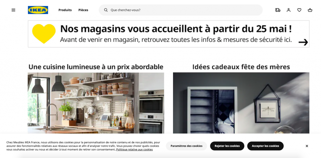
Ikea is one of the few companies to apply this practice, by implementing not two but three buttons, one of which is dedicated to rejecting trackers. The brand anticipates the recommendations of the CNIL, which will require symmetry in the choice between acceptance and rejection. Proposing an identical design for the acceptance and rejection of cookies, the brand does not seek to influence the user, who can reject them with a single click.
An appreciable, ethical and frankly user friendly approach!
Before looking at 15 examples of banners, more or less compliant with regulations and personalised, know that Didomi has organised 2 webinars on the recommendations of the CNIL, accessible on our YouTube channel: "Cookies & Trackers: What legal & technological changes should we know in 2020?". (in French) and "CNIL Recommendations: Are you compliant with the new rules on cookie consent?". (in French). They include many tips for setting cookie consent on your websites and mobile applications.
Want to implement a bespoke cookie banner with the Didomi CMP?

15 examples of cookie collection banners
Some websites have taken the position that they don't do like everyone else. Many of them have understood the importance of cookie compliance in creating transparency and brand loyalty with users. Didomi has made a short list for you to draw inspiration from... or not. Come on, it's a gift!
1 - Invision
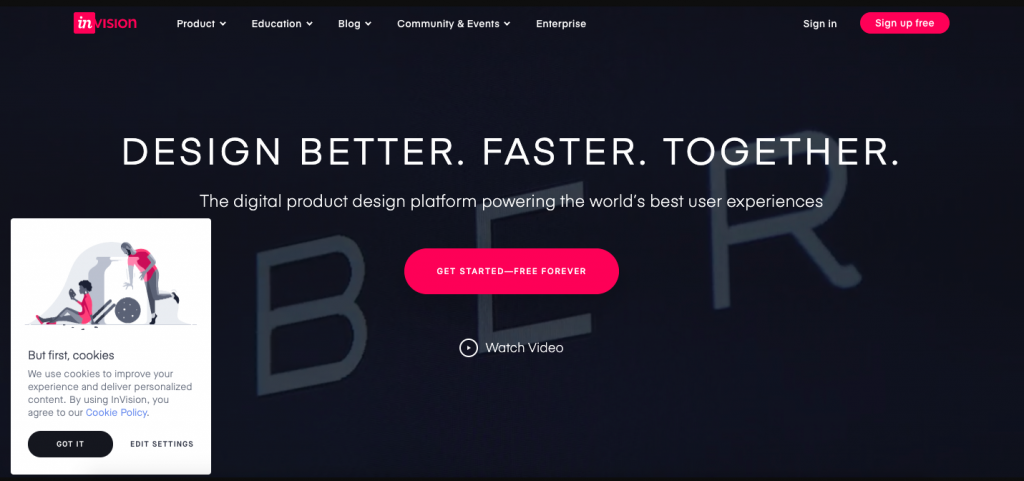
The first thing that hit us? The text! "First, the cookies." It's clear, crisp and precise. The style is adapted to the aesthetics of the site with minimal but still perceptible intrusion since the banner is present on all pages. With its cookies hidden in the design, Invision's banner is discreet but original! It has to be said that, from a reference tool for designers, we did not expect anything less.
It's a pity, however, that it takes half a dozen clicks to refuse the deposit of cookies.
2 - Deezer
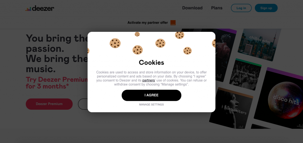
Do you want to force your users to consent or not to your cookies before allowing them to access your site? Do like Deezer and make your banner more fun!
Once again, refusal is impossible on this first level of consent.
3 - Backmarket
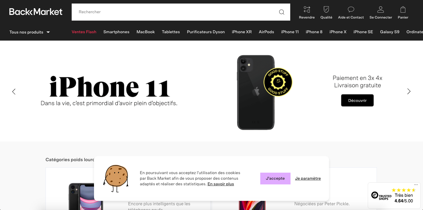
Backmarket is strong on the personalisation side!
Rather than using the frozen drawing of a cookie, the brand has chosen to animate it. Yes, the cookie is actually a GIF that makes this banner very visual. It's impossible to escape it. We really like the preferences page in Comic Sans MS, even if the refusal of the cookie deposit is well hidden at the bottom of it.
4 - Waze
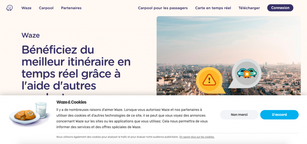
Although Waze's cookie banner is quite imposing, it is still pleasing to the eye. No doubt thanks to the image that was integrated into it. By the way, did you spot the logo of the brand that replaced the cookies on the plate?
Plus, even if there's a difference in the colour of the buttons, it's possible to refuse them from the first level. Bravo !
5 - Snapchat
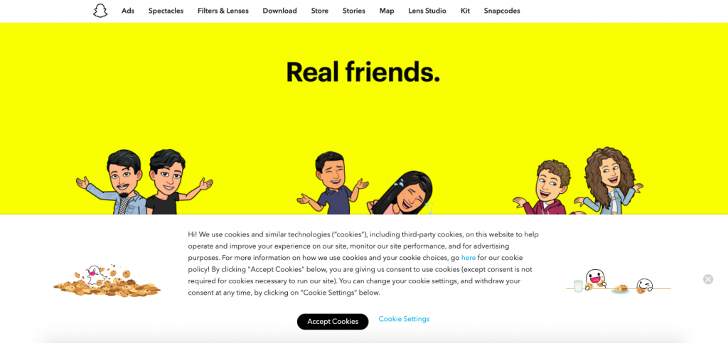
At Snapchat, there's no need to squint to find them: the brand's little ghosts are EVERYWHERE! A nice way to make your cookie banner more dynamic and personal. The settings page is also simple and understandable.
6 - Michel et Augustin
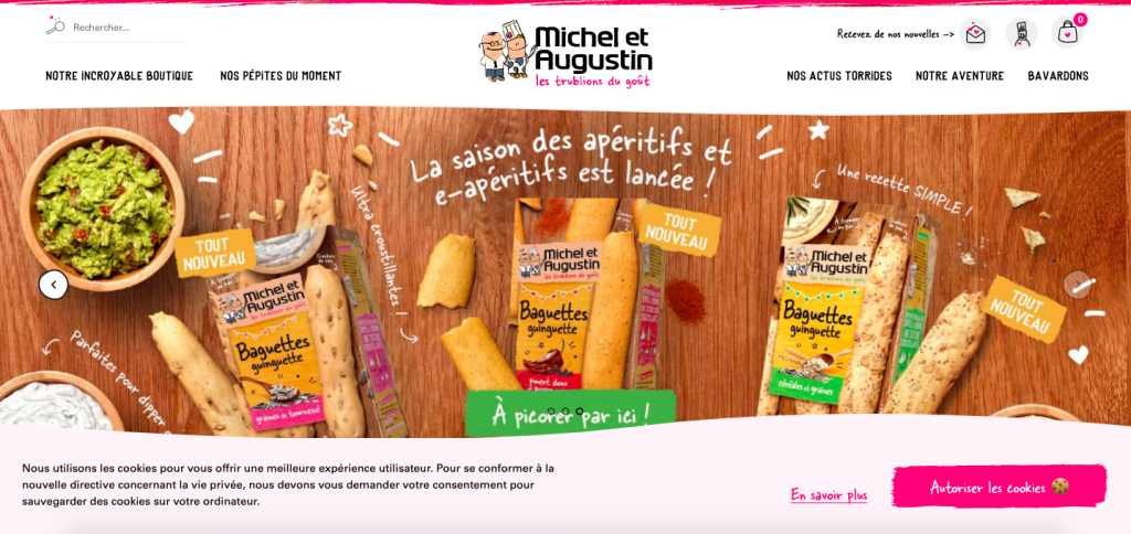
If there is one brand that has played the personalisation card to the fullest, it is Michel and Augustin. An offbeat design, specific to the brand, a button that takes the appearance of a brushstroke integrating the image of a cookie... The brand undoubtedly wins the golden palm of gold for branding in the cookie banner category. Bad point: no refusal possible, and a page below what we are used to from the taste buffs.
7 - Orange
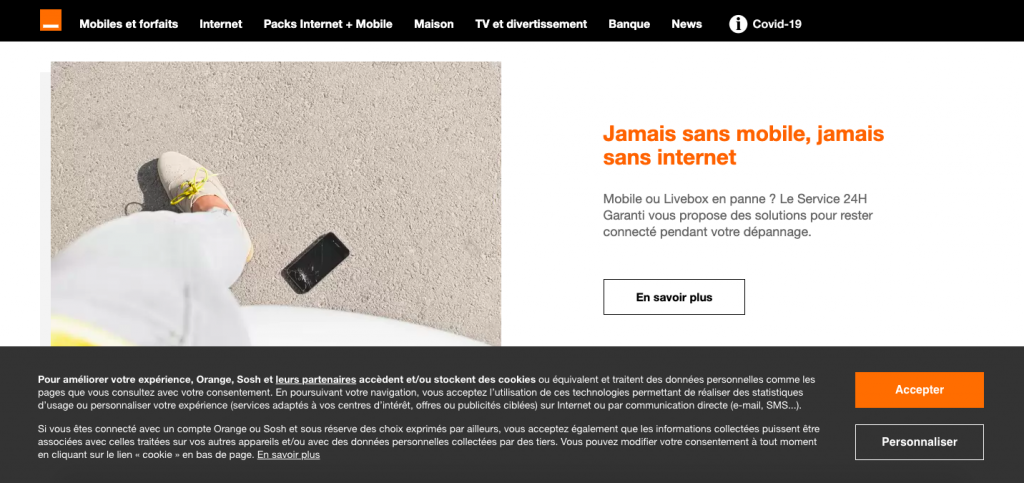
For Orange, the brand image can be found even in its cookies banner, sober. Two buttons have been cleverly placed there, since the brand leaves the user the choice to consent or not to the trackers, while visually encouraging him to click on the "Accept" button. The "Personalise" button refers to a clear interface that allows Internet users to "Refuse" cookies, generally speaking, by group of purposes or individually by advertising partner!
8 - Le Slip Français
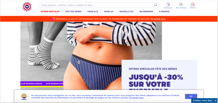
Like Back Market, here the cookie (in briefs) is animated. The French panties also gave it relief by adding a shadow around the banner. A nice idea to make the cookie banner more visible without making it too imposing.
Too bad, once again, that the refusal is not possible directly, neither on the banner nor on the page dedicated to personal data. Indeed, this one only refers you to a third party site, comment-supprimer.com/cookies, which explains how to set up your web browser.
9 - Kinder
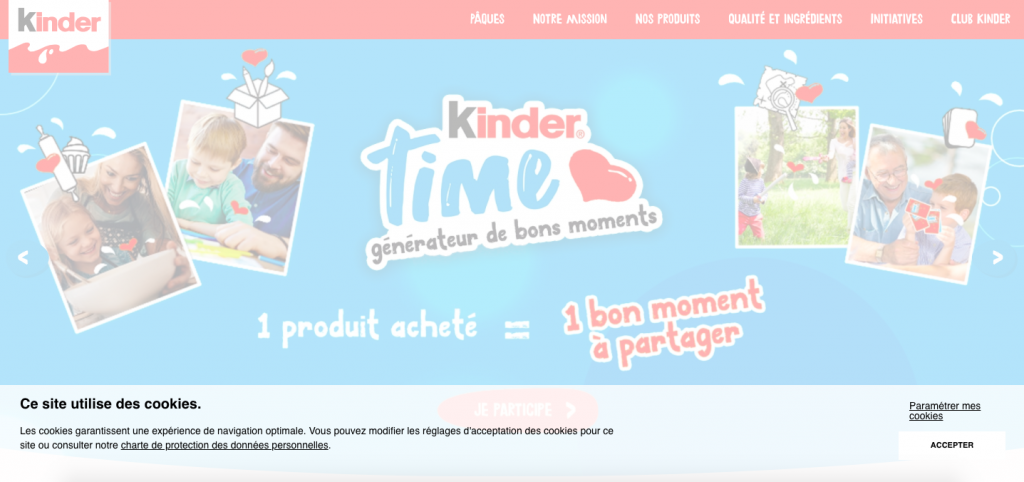
Rather than darkening the background when its cookie banner appears, Kinder does the opposite and brightens it up! A great idea for those who want to prevent the user from accessing content before giving their consent to cookies. The little extra of this banner? Its refusal feature, accessible via the "Set my cookies" button. The brand clearly displays the use it makes of cookies: better, it assumes it.
10 - Revolut
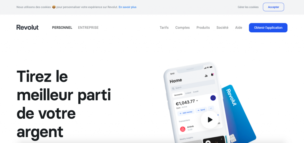
Revolut has chosen to install a simple and sober cookie banner in compliance with its graphic charter. The little extra that immediately catches the eye: a very visual cookie! Impossible to refuse immediately, but it is possible to do so via a pop-up is accessible directly via "Manage cookies" or via the page dedicated to cookies.
A user experience at the level of a neobank that communicates a lot about transparency and ease of use.
11 - Burger King
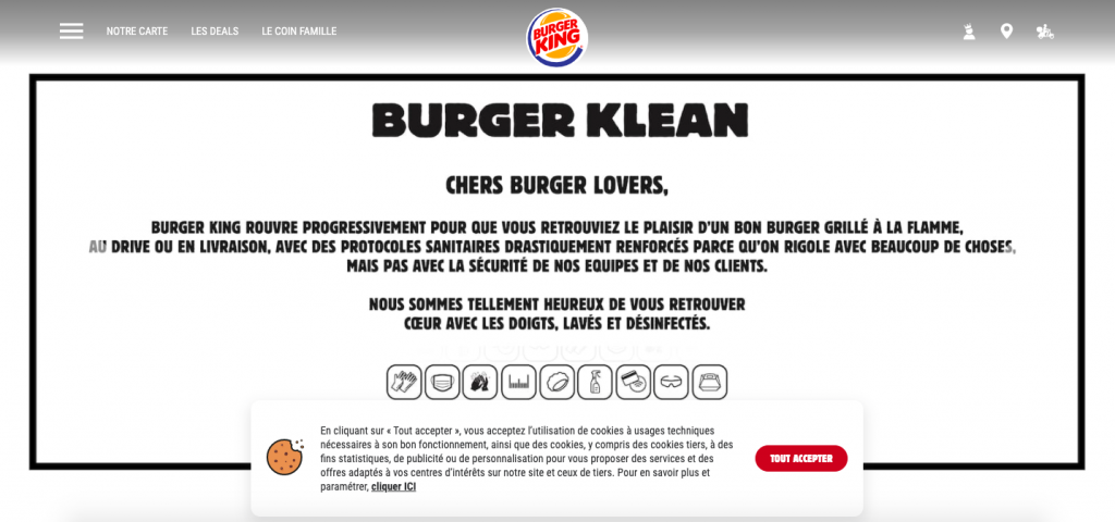
Between the size of the banner, which is deliberately narrower, the red color of the button and the design of the cookie, the user's eye is directly drawn to it. Statistics and advertising cookies are disabled by default (a good point for Burger King), so the brand has every interest to make its visitors click on "Accept all". At the same time, it is impossible to refuse.
12 - Innocent
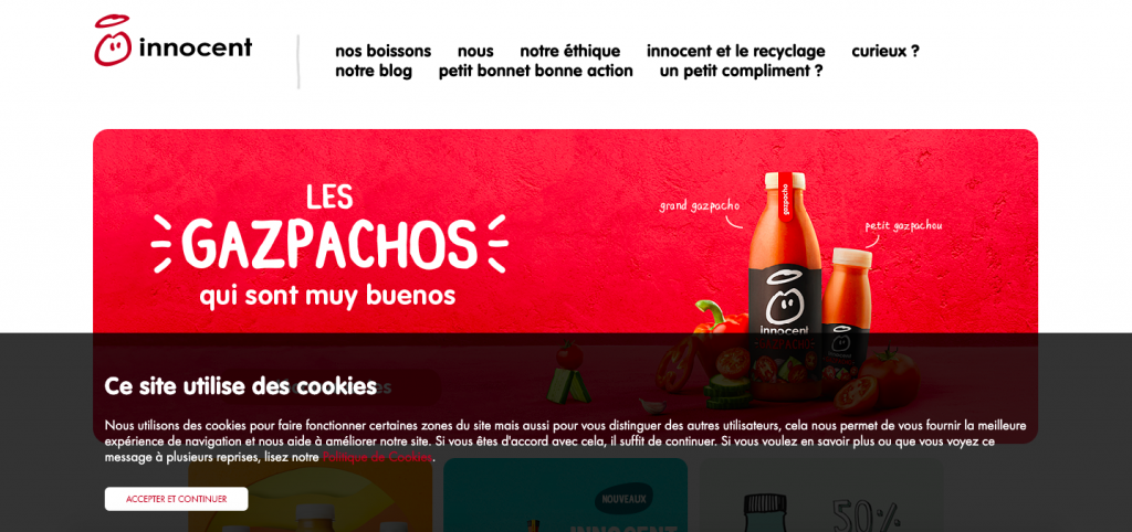
Innocent's cookie banner is also a good example. It is wider and highly visible because of its colour, which stands out from the rest. What we especially like is that the brand doesn't dither and dares to say yes, its site uses cookies. The user therefore acts with full knowledge of the facts.
But, once again, it is impossible for him to refuse! Like Le Slip Français, you have to go far in the cookie policy to find a link to a site (in English) that refers the user to the settings of his own browser.
13 - Qonto
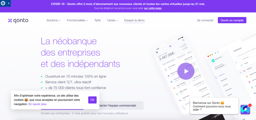
Qonto has opted for discretion. Although the design is quite simple, the white colour of the banner stands out against a slightly darker background. Qonto did everything possible to make it fit naturally into its site, for a truly successful result.link
The refusal to deposit cookies will, however, be impossible. The dedicated page refers you to the cookie policy of the tools used by Qonto (a nice effort!) and refers you to your own smartphone or computer settings. The overseas competitor mentioned above is more of a gentleman.
14 - Strava
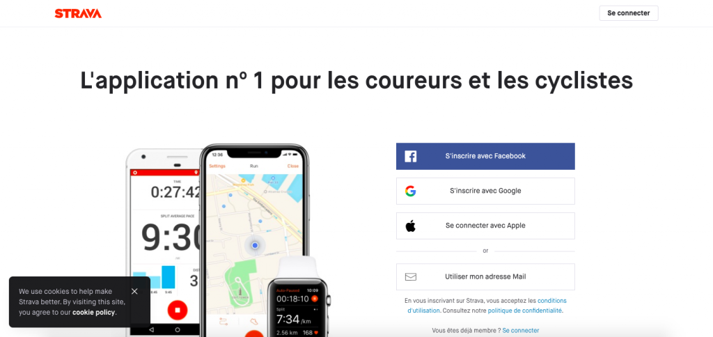
Discreet with its minimalist design, this banner is nevertheless impossible to miss. And the choice of colour is not for nothing: black on white, it stands out for sure!
The message only informs you that you accept cookies. You can't refuse. Once again, in the dedicated page, you will be sent back to your browser settings. This default consent", which is very common, will soon no longer be possible in France and Europe.
15 - BNP Paribas
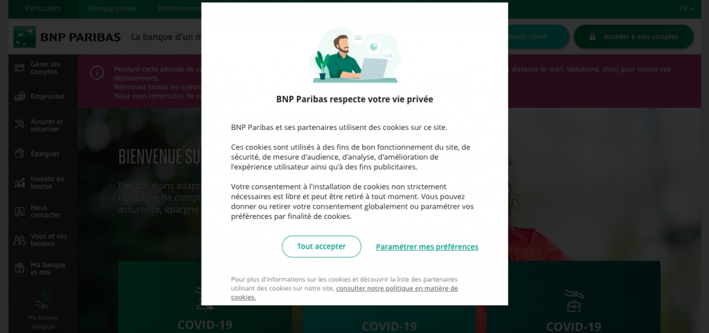
Educational content, a contemporary, designer visual, and a choice of colour in line with BNP Paribas' graphic charter are the strong points of this banner. All that's missing is the "Refuse" button next to the one you already see, or a possibility to close the window to continue browsing.
Also in terms of settings, the bank of a changing world respects users, since all the purposes for which cookies are used are unchecked by default. You will be able to (quite) easily refuse donations.
Conclusion

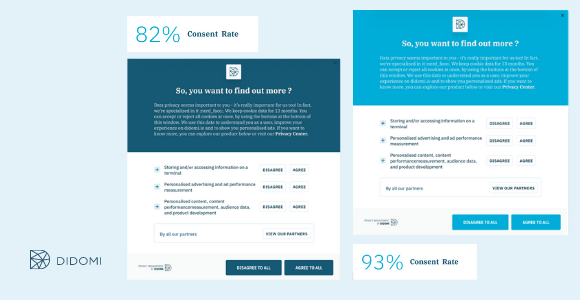
With Didomi, brands (and their agencies) can optimise consent rates by performing A/B tests.
You now have a few examples in mind of what is being done in terms of cookie banners for French and foreign brands. Some of them are personalised and functional, allowing web users to choose freely, others are not!
Obviously, not all these companies are subject to the same regulations, not all make the same use of trackers and cookies, and some use dedicated external solutions (like Didomi) while others have an "in-house" solution that simply refers to their privacy policy.
Please note that the above only concerns banners, i.e. the first step of consent. Cookies with briefs are nice, but informed consent can go much further than that!
The latest version of the TCF (discussed above) requires publishers and companies to explain the purposes of collection or to be able to consent - or not - individually to each cookie. Only Orange is up to scratch!
In short: take the time to work on yours. It's important, both for the effectiveness of your digital marketing and for the user experience you offer to your Internet users. Transparency creates trust, which will have a significant impact on your brand image and your revenues!

Want to find out more? Contact us!